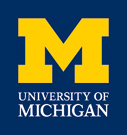
One Maize. One Blue. One Block M.
Pull them together and you have an updated logo for the University of Michigan. The refreshed look recently was unveiled to campus communicators and now is available for use.
“The university’s visual identity is powerful and memorable, with the Block M representing the distinction U-M is known for worldwide,” says Vice President for Global Communications Lisa Rudgers. “We will now have an even stronger, more consistent global presence.”
The refined visual identity system features one of the world’s most recognized letters of the alphabet — the maize Block M — on a deep blue background. Below are the words “University of Michigan” set in a custom-designed typeface named, appropriately, Victors.
Rudgers emphasizes that the updated approach encourages consistency of use and has been designed to work well across a variety of platforms in print and in digital form.
“We gleaned valuable insights from academic, auxiliary and administrative units throughout the eight-month-long process,” Rudgers says. “And we are grateful for the thoughtful feedback on all the ways in which we use logos and signatures across campus.”
The refreshed identity system now is available at this Web address: www.umich.edu/brand.
Included on the brand website is an explanation of the updated logo, the precise size and color specifications and a style guide highlighting best practices for U-M branding in editorial tone and visual execution. There are downloads available and a “signature generator” so units across the university can create their own, consistent visual identities using the refreshed logo.
The website also includes a message from President Mary Sue Coleman who says, “Adopting this common identity reinforces the academic excellence that is synonymous with the University of Michigan. It pays tribute to our collective heritage, allows us to speak in one voice and helps us move into our third century as one of the world’s great universities.”
U-M Brand Manager Steve Busch says the university’s logo is more than the Block M alone, but also notes that the refreshed logo will look very familiar. “Nothing has changed dramatically,” Busch says. “The logo is a subtle, but definitive shift in the long-term identity to maximize visual impact.”
Busch says that during the development process, he met with leaders from all 19 schools and colleges on the Ann Arbor campus, as well as officials from UM-Flint, UM-Dearborn, the Health System, and several auxiliary and administrative units. Support for the update was widespread.
One key to making the change will be its gradual implementation over the coming year.
“We want to be good stewards of resources, so we are encouraging units to exhaust all existing branded print materials before moving to the updated logo,” Rudgers says.

